Light and Color: A Primer for Photographers#
How light works, how we see it, how cameras capture it, and how we reproduce it. Understanding these fundamentals is essential for making informed decisions about color — whether on land or underwater.
1. Light is a spectrum#
Light is electromagnetic radiation — the same physical phenomenon as radio waves, microwaves, X-rays, and gamma rays, differing only in wavelength. What we call “visible light” is the narrow band of wavelengths that the human eye can detect, roughly 380nm (violet) to 700nm (red). Below this range sits ultraviolet; above it, infrared. The full electromagnetic spectrum spans many orders of magnitude, but everything we see — every color, every image — comes from this sliver.
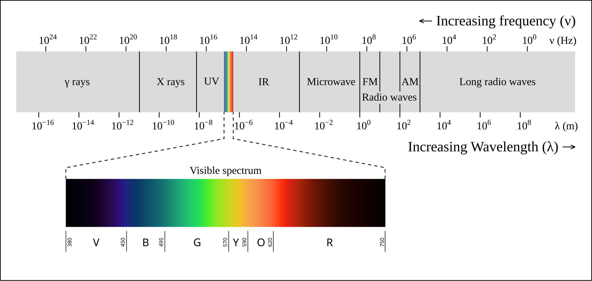 Electromagnetic spectrum. Visible light occupies a narrow band between ~380–700nm. Source: Wikimedia Commons, CC BY-SA 2.5.
What makes light “colored”?#
A single wavelength of light corresponds to a specific spectral color — 450nm looks blue, 550nm looks green, 650nm looks red. But most light we encounter isn’t a single wavelength. It’s a mixture — a distribution of energy across many wavelengths simultaneously, called a spectral power distribution (SPD). Sunlight is a broad, roughly continuous hill across the visible range. A sodium street lamp is a sharp spike near 589nm. A fluorescent tube is a series of narrow peaks at specific wavelengths. The SPD is what defines the character of any light source.
Not all light sources are equal#
Every light source has its own SPD, and the differences matter for photography.
Incandescent and halogen bulbs produce a broad, smooth SPD with energy at every visible wavelength. All surface colors are rendered faithfully. This is the baseline that other sources are compared against. As the chart below shows, their emission extends well beyond 700nm — that energy is infrared radiation, which we experience as radiant heat. Most of an incandescent bulb’s output is actually infrared, which is why they run hot and are inefficient as light sources.
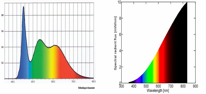 Spectral power distribution of a phosphor-converted white LED (left) showing the characteristic blue spike and phosphor hump, vs an incandescent lamp (right) with its smooth, continuous curve. The incandescent emission beyond ~700nm is infrared radiation. Source: Ismael (2020) 1.
Phosphor-converted white LEDs — the most common type in modern lighting — work differently. A blue LED die (~450nm) excites a yellow phosphor, producing a sharp blue spike plus a broad yellow-green hump. The result can match the same color temperature as an incandescent bulb, but the spectral shape is very different: there’s a valley in the cyan region (~480–500nm) where little energy is emitted. Objects whose color depends on reflecting those missing wavelengths — certain blues, teals, skin tones — can appear subtly wrong under LED light compared to incandescent at the same rated color temperature.
RGB LEDs — used in displays and video lights — mix three narrow-band emitters (red ~625nm, green ~525nm, blue ~465nm) to produce any apparent color, including white. The spectrum is three isolated spikes with almost nothing between them. On a screen this works fine. But as illumination, RGB light renders object colors poorly — a surface that reflects primarily between the peaks receives almost no energy and appears dark and desaturated.
Photographic strobes aim for a broad, daylight-like spectrum (~5500K) specifically to render all surface colors accurately. This is why a flash produces natural-looking color in a way that many LED lights do not, even at the same rated color temperature.
The key point: color temperature is a single-number summary that hides spectral detail. Two lights at the same CCT can produce noticeably different colors on the same subject — because the color we see depends not just on the light’s apparent warmth or coolness, but on which wavelengths it actually emits. A surface can only reflect what the source provides, so gaps in the spectrum mean missing color, regardless of what the CCT label says.
Two light sources can look the same color to us while having completely different spectral distributions. This distinction between appearance and physics runs through everything that follows.
2. Colored objects#
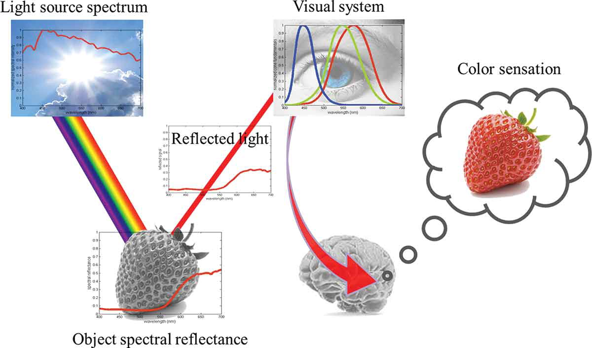
An object doesn’t emit its own color — it selectively absorbs and reflects wavelengths from the light falling on it. A red apple absorbs most short-wavelength light (blue, green) and reflects back the longer wavelengths (red, orange). What we perceive as “the color of the apple” is the interaction of two things:
light reaching the eye = illuminant SPD × object reflectanceThis spectral reflectance function — which wavelengths a surface absorbs and which it reflects — is a physical property of the material. Change the illuminant and the same apple looks different. Under warm tungsten light it glows; under blue sky it’s muted. The object hasn’t changed — the light has.
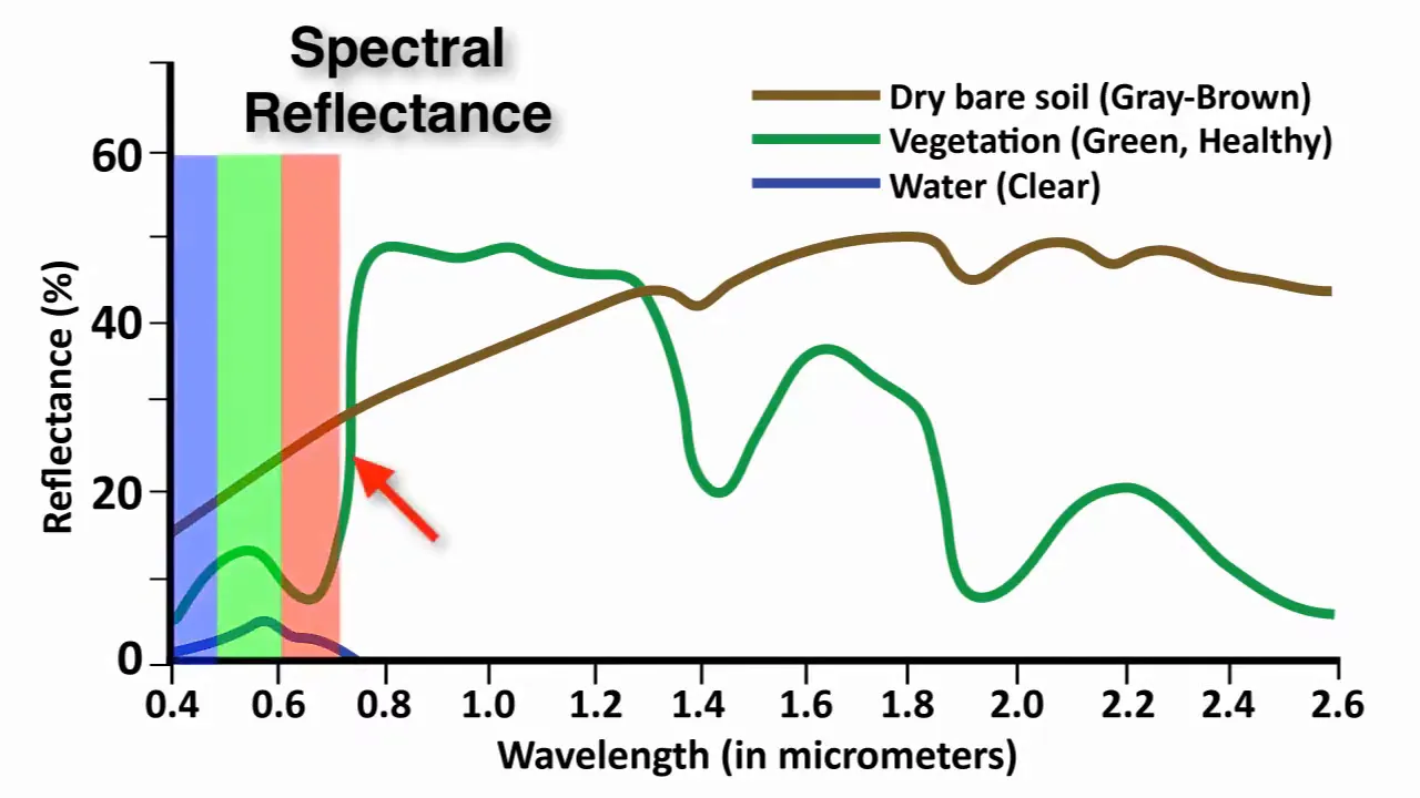 Spectral reflectance curves of common natural surfaces. Vegetation shows strong absorption in visible wavelengths (due to chlorophyll) and high reflectance in near-infrared; soil reflects more evenly across the spectrum; water absorbs strongly beyond visible wavelengths. Source: Mapscaping.
3. Human vision — seeing color, adapting to light#
The hardware#
The retina has three types of cone cells, each sensitive to a different — but overlapping — range of wavelengths 2:
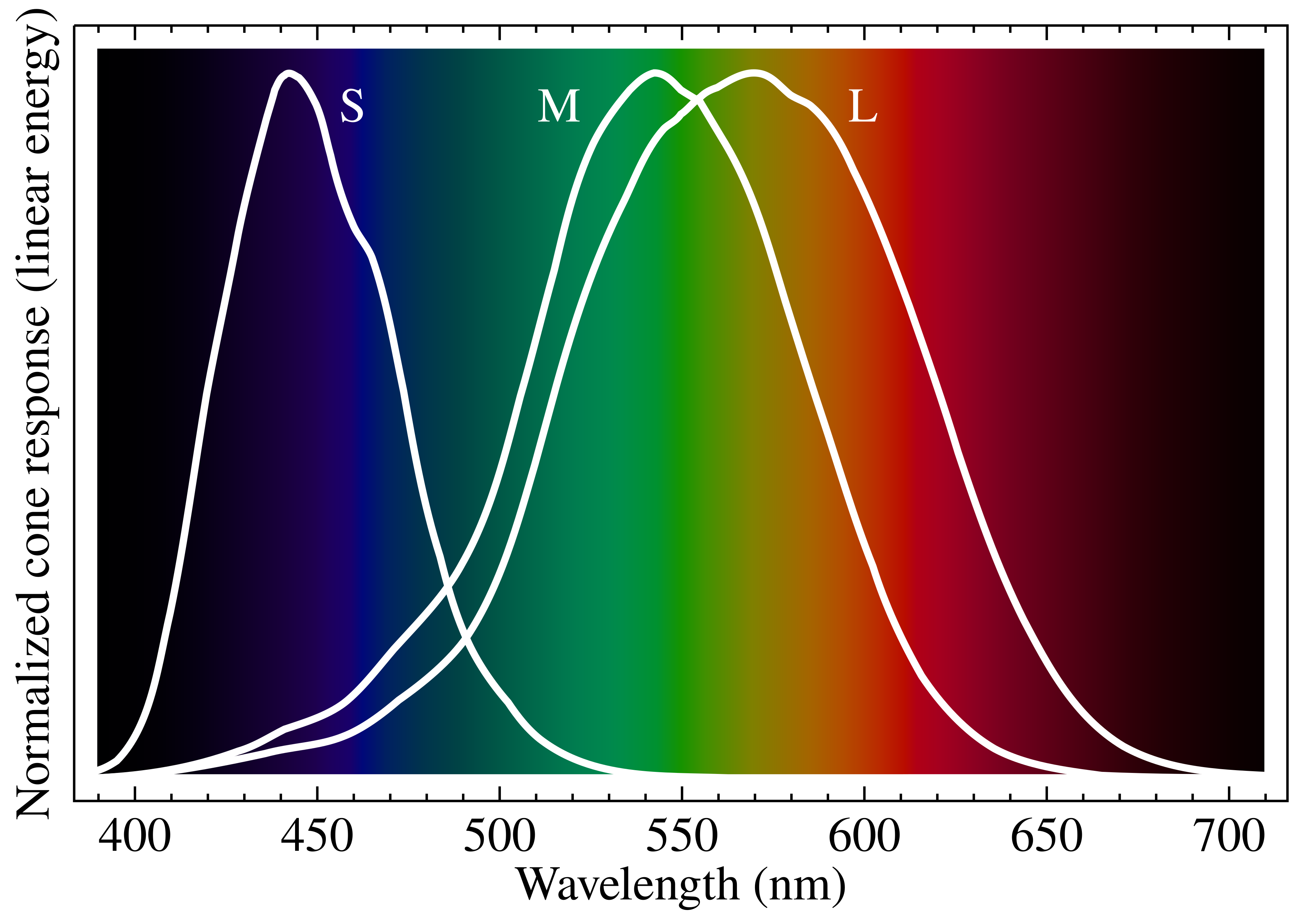 Normalized spectral sensitivity of human cone cells (S, M, L) overlaid on the visible spectrum. Source: Wikimedia Commons, CC BY-SA 3.0.
- L cones (long-wavelength) — peak sensitivity around 560nm, covering yellow-green through red
- M cones (medium) — peak around 530nm, centered on green
- S cones (short) — peak around 420nm, covering blue-violet
Every color sensation is the brain’s interpretation of three signals: how strongly each cone type responds. An infinite-dimensional spectrum is collapsed into just three numbers. This is efficient but lossy — we’re blind to spectral differences that happen to produce the same L/M/S ratio.
Metamerism#
Because of this three-channel compression, very different spectra can produce identical perceived colors. A single-wavelength yellow at 580nm and a mix of 540nm green + 620nm red can stimulate L and M cones in the same proportion — and look identical. They’re metamers: same appearance, different physics. Two colors that match under daylight may diverge under a different illuminant, because the underlying spectra interact differently with the new light. This is called metameric failure.
This is also what makes RGB displays possible — three narrow-band emitters can produce any perceived color, because they only need to match three cone responses, not reproduce a full spectrum (section 5).
White balance in the brain#
Human vision has a powerful adaptation mechanism: chromatic adaptation 3. Walk from daylight into a room lit by warm tungsten bulbs and within seconds, a white sheet of paper still looks white — even though the spectrum hitting your retina has shifted dramatically toward red/orange. The visual cortex recalibrates its interpretation of cone signals based on context: it recognizes objects whose color it “knows” (skin, paper, familiar surfaces) and adjusts the overall color interpretation so those objects appear as expected. This is partly low-level retinal adaptation (cone cells adjusting their gain) and partly a higher-level cognitive process — the brain draws on memory colors, learned expectations of what things should look like 4.
This adaptation is automatic, largely unconscious, and remarkably effective across a wide range of illuminants. But it has limits. The brain can adapt to illuminant shifts (warmer, cooler) because the spectrum is still broadly continuous — just tilted. When entire spectral regions are missing — for example under narrow-band lighting or extreme filtering — the adaptation mechanism is working with incomplete information. In those cases, the brain may fill in expected colors from memory, creating a perception that photographs of the same scene don’t confirm. The brain was compensating to a degree that the camera, recording raw physics, cannot.
Putting it together#
Seeing color is a chain of transformations. A light source emits a spectrum (its SPD). That light hits a surface, which absorbs some wavelengths and reflects others (its spectral reflectance). The reflected light enters the eye, where three types of cone cells each respond to a different range of wavelengths. Finally, the brain interprets those three signals as a single perceived color. Each stage shapes the result — change the light, the surface, or the observer, and the color changes.
4. How cameras capture photos#
The sensor and its filters#
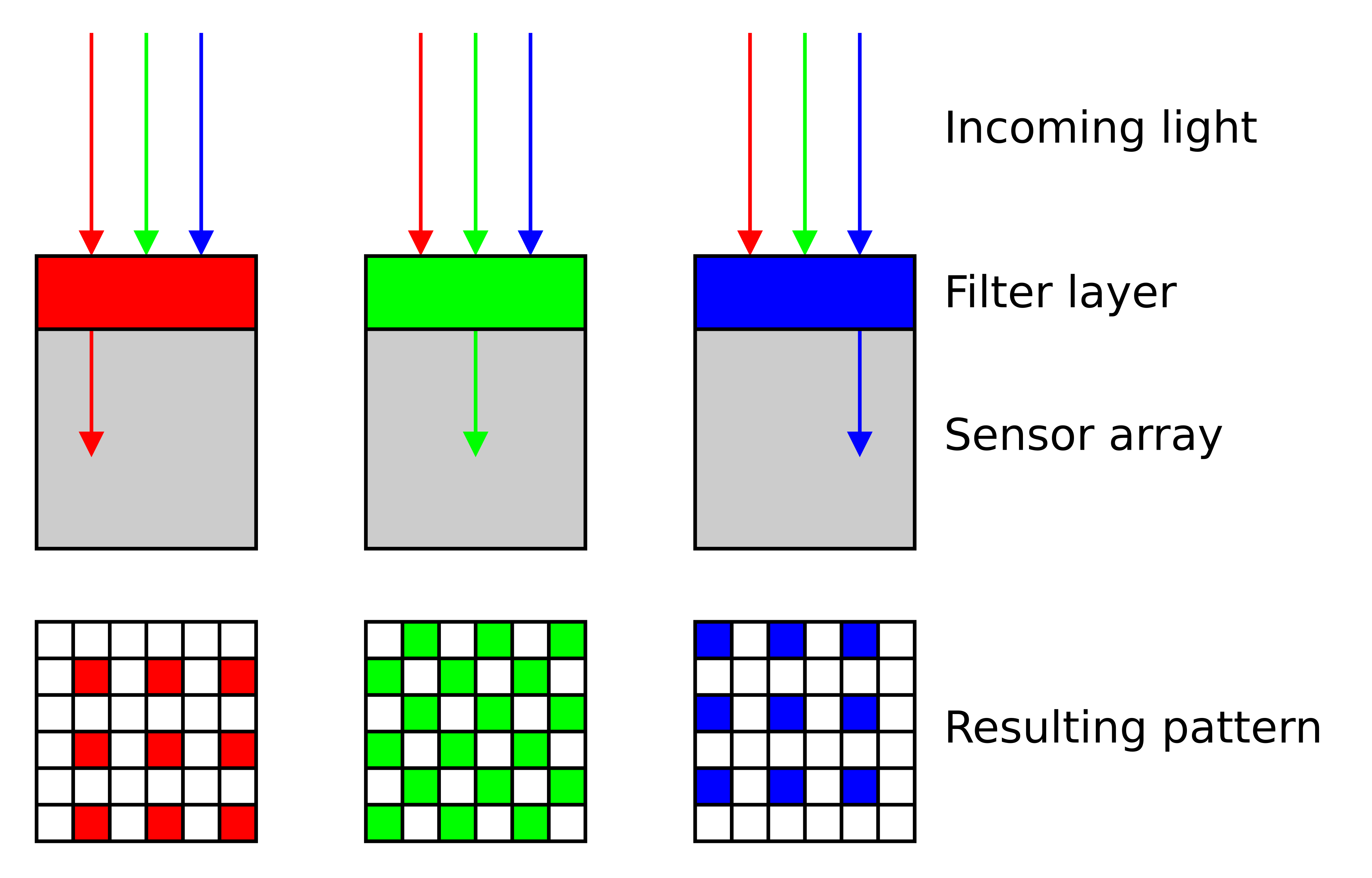
A digital camera sensor is a grid of photosites — essentially tiny light-measuring buckets. Each photosite is sensitive to a broad range of wavelengths, including infrared and ultraviolet — bare silicon doesn’t distinguish color 5. To create a color image, each photosite is covered by a tiny color filter (red, green, or blue) that blocks most of the spectrum and passes only a selected band. These filters are arranged in a repeating pattern called a Bayer mosaic 6, with twice as many green filters as red or blue — mimicking the human eye’s higher sensitivity to green.
 Cross-section of a Bayer color filter array on a sensor. Source: Wikimedia Commons, CC BY-SA 3.0.
Each filter has a broad, bell-shaped spectral transmittance 7:
- Green filter — peaks around 530nm, broadest response, highest quantum efficiency (QE)
- Blue filter — peaks near 460nm, moderate QE
- Red filter — peaks around 600nm, relatively narrow, lowest QE of the three
Just like cone cells, the sensor collapses the incoming spectrum into three channel values. But the filter curves aren’t identical to human L/M/S — they’re constrained by silicon physics and dye chemistry 8. Camera RGB and human perception are related but not equivalent.
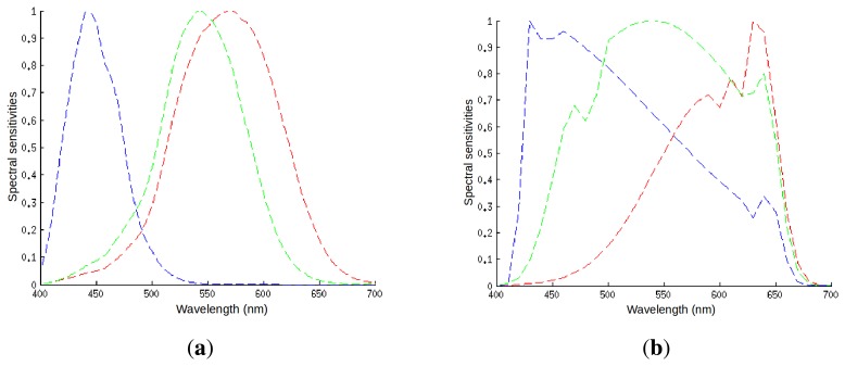 Spectral sensitivities of (a) human cone cells and (b) a typical digital camera sensor. The shapes differ significantly. Source: Vazquez-Corral et al. (2014) 8, CC BY 4.0.
RAW and bit depth#
Each photosite produces an analog voltage proportional to the light it received. The camera digitizes this into a number and stores it in a file. How many discrete levels that number can represent — its bit depth — determines how much tonal precision is preserved. When a camera saves a RAW file, it stores these unprocessed sensor readings — typically at 14-bit (16,384 levels) or 16-bit (65,536 levels) per channel. This is vastly more data than the 8-bit (256 levels) of a JPEG. In practical terms, a 14-bit RAW file preserves subtle signal differences that are invisible in a JPEG. When one channel is severely weakened — by a tinted filter, an unusual illuminant, or any extreme lighting condition — the signal might look gone on screen, but the RAW file often still contains recoverable information buried in the lower bits. This is why shooting RAW matters whenever color accuracy is important.
White balance#
We expect photographs to show us the actual colors of a scene — a white sheet of paper should look white, a red shirt should look red, regardless of whether the photo was taken under noon sun, overcast sky, or a warm desk lamp. But as we saw earlier, the light reaching the sensor is illuminant SPD × object reflectance. Different illuminants tint everything: tungsten light pushes the whole image warm, shade pushes it cool. The raw sensor data faithfully records this tint.
White balance is the correction that removes the illuminant’s influence, so that the image shows the colors of the objects, not the color of the light. It’s the camera’s equivalent of the brain’s chromatic adaptation — but applied as a deliberate processing step rather than an automatic, unconscious one.
Color temperature#
To apply white balance, the camera needs to characterize the illuminant. This is where color temperature comes in.
The concept comes from black-body radiation 9: a theoretical perfect emitter (like a heated piece of metal) produces a characteristic SPD that depends only on its temperature. At ~2700K it glows warm orange (like a candle); at ~5500K it approximates noon daylight; at ~10000K+ it shifts toward blue. The curve that all black-body radiators trace through color space is called the Planckian locus. Many real-world light sources fall close enough to this curve that a single number — correlated color temperature (CCT) — usefully describes their overall spectral character.
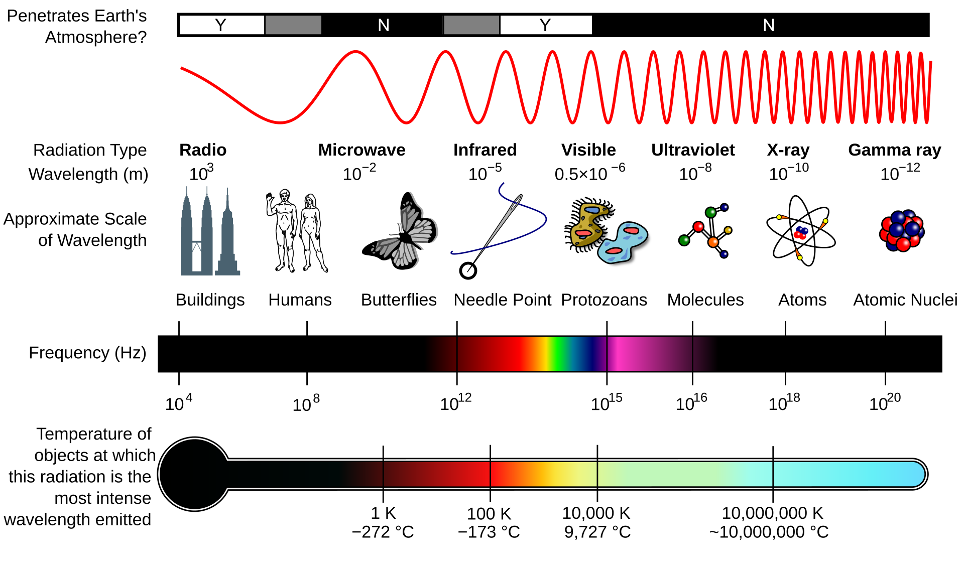 Properties of the electromagnetic spectrum. Source: Wikimedia Commons, CC BY-SA 3.0.
How white balance works#
Camera white balance applies per-channel multipliers to the raw sensor data, compensating for the illuminant’s color temperature so that neutral objects appear neutral in the final image. Unlike the brain’s continuous, unconscious adaptation, digital white balance is applied after capture — the raw data is recorded first, the correction computed and applied afterward. Auto white balance (AWB) algorithms estimate the illuminant’s CCT from scene statistics: they look for things that are probably white or gray and compute the channel multipliers needed to neutralize them.
This works reasonably well when the illuminant falls near the Planckian locus and can be described by a single CCT value — daylight at 5500K, overcast at 6500K, tungsten at 3200K. It breaks down when the illuminant doesn’t correspond to any color temperature — mixed lighting, narrow-band sources, or any situation where the spectrum isn’t a smooth, continuous curve. In those cases, AWB algorithms have no good model and tend to produce partial or incorrect corrections.
5. Reproducing color#
We’ve covered how light carries color information, how the eye interprets it, and how cameras capture it. The last piece is reproduction — how do we create color on screen or on a physical surface?
Additive color — screens#
A monitor creates color by emitting light from tiny RGB sub-pixels. Each sub-pixel produces a narrow band of wavelengths. By varying the intensity of red, green, and blue emission independently, the display can simulate a wide range of colors. More light means more color — R+G+B at full intensity produces white. This is additive color mixing, and it’s how every screen you look at works.
A screen showing “yellow” emits red + green light — no 580nm photons at all — but L and M cones respond as if it were true spectral yellow. The display doesn’t need to reproduce a continuous spectrum; it only needs to stimulate three cone types in the right ratio. This works because the display is the final destination — it creates light for the eye, not for illuminating objects.
Subtractive color — ink and print#
Printing works the opposite way. You start with white light (reflected off a white substrate) and subtract wavelengths using pigments or dyes:
- Cyan ink absorbs red, reflects blue + green
- Magenta ink absorbs green, reflects red + blue
- Yellow ink absorbs blue, reflects red + green
Layering all three should theoretically absorb everything and produce black. In practice, real inks are imperfect absorbers, producing a muddy brown. That’s why K (Key/Black) is added — a carbon black pigment that provides clean, neutral density. This is the CMYK system used in commercial printing.
A printed surface doesn’t have an “RGB value” — it has a spectral reflectance curve shaped by the combination of inks and substrate. This means printed colors are subject to metameric failure: a gray made from equal parts C, M, and Y isn’t spectrally flat — each ink has bumps and dips in its reflectance. Under a different illuminant, those bumps shift the perceived color. A gray made from K-ink only has a much flatter spectral profile and remains neutral across a wider range of lighting conditions.
The previous sections covered each piece in isolation — light, surfaces, eyes, cameras, screens. The next article puts them together into a single chain and shows where that chain can break: The Digital Imaging Chain.
References#
-
Ismael, A.F. (2020). “UV/Blue Light Conversion Using Dyes Polymeric Materials.” Solid State Phenomena, 301, 52–59. DOI: 10.4028/www.scientific.net/SSP.301.52. ↩︎
-
Stockman, A. & Sharpe, L.T. (2000). “The spectral sensitivities of the middle- and long-wavelength-sensitive cones derived from measurements in observers of known genotype.” Vision Research, 40(13), 1711–1737. See also: CIE 170-1:2006 Fundamental Chromaticity Diagram with Physiological Axes. ↩︎
-
von Kries, J. (1902). “Chromatic adaptation.” Festschrift der Albrecht-Ludwigs-Universität. The foundational theory of independent channel gain control in chromatic adaptation. ↩︎
-
Hurlbert, A.C. (2007). “Colour constancy.” Current Biology, 17(21), R906–R907. ↩︎
-
Nakamura, J., ed. (2006). Image Sensors and Signal Processing for Digital Still Cameras. CRC Press. Chapter 1 covers silicon photodiode spectral response. ↩︎
-
Bayer, B.E. (1976). “Color imaging array.” US Patent 3,971,065. ↩︎
-
Jiang, J., Liu, D., Gu, J. & Süsstrunk, S. (2013). “What is the space of spectral sensitivity functions for digital color cameras?” IEEE Workshop on Applications of Computer Vision (WACV), 168–179. See also: Nakamura, J., ed. (2006). Image Sensors and Signal Processing for Digital Still Cameras. CRC Press. ↩︎
-
Vazquez-Corral, J., Connah, D. & Bertalmío, M. (2014). “Perceptual Color Characterization of Cameras.” Sensors, 14(12), 23205–23229. DOI: 10.3390/s141223205. ↩︎ ↩︎
-
Planck, M. (1901). “Ueber das Gesetz der Energieverteilung im Normalspectrum.” Annalen der Physik, 309(3), 553–563. For photography: CIE 015:2004 Colorimetry, 3rd Edition. ↩︎